
Working on brands and visual identities is a skill set I have always pursued and enjoyed.
Along with the creation of the identity itself, there is still the supporting assets, the guidelines and toolkits and branded documents allowing the client to hit the ground running .

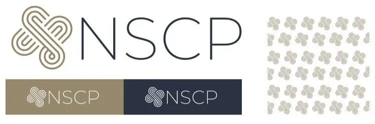
NORTHERN SYDNEY CONSULTANT PSYCHOLOGISTS
I crafted a visual identity for a psychologist consultancy that was envisioning a unique, elegant and professional mark to reflect the businesses position.
Using interlacing paths and the company’s initials to create the monogram, teamed with the timeless colour palette, created the distinct look the client was aiming for.
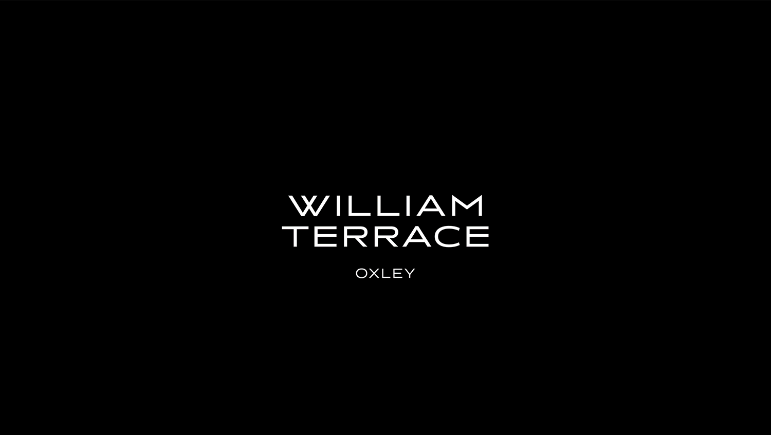
WILLIAM TERRACE
Most of the clients the studio I was was apart of was creating marketing material for mulit-million / billion dollar developments. Occasionally we produced a an identity and key pieces of collateral for smaller, bespoke developers.
I created the visual identity, name and collateral that incorporated the new identity and aligned with the parent company’s core brand.
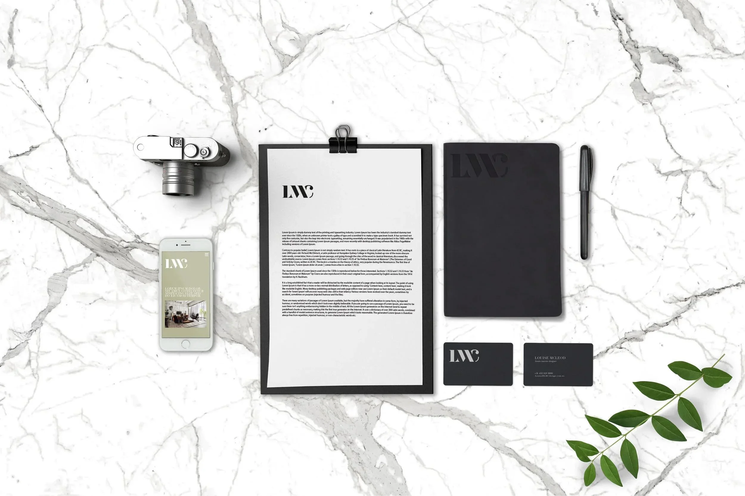
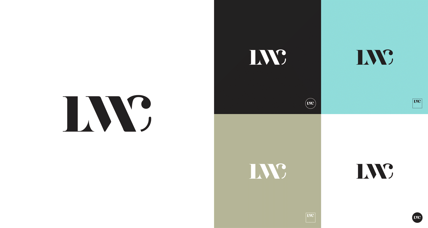
LOUISE MCLEOD INTERIORS
I created the visual Identity for a small interior design business based in the north of Sydney.
Creating a traditional, strong vision the owner aligned with. Bold, black and white personalised serif monogram logo mark. To compliment the identity I created all the assets and marketing material.
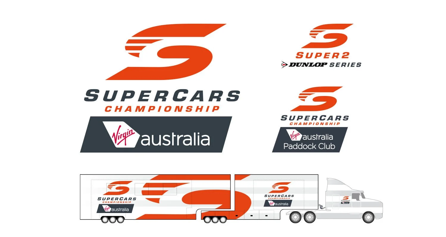
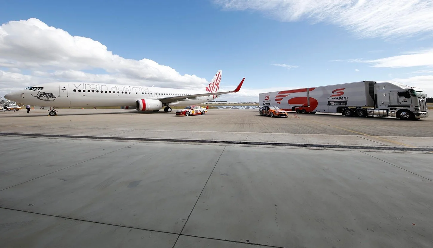
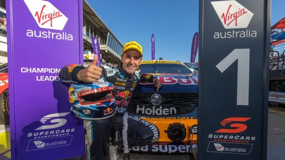
SUPERCARS CHAMPIONSHIP AUSTRALIA
Working with the Creative Director, I set up and created the new logo to reflect the new title sponsor of the series. The final logo reflected all the stakeholders brand values and corporate styleguides. This then filtered down to all the other touchpoints of the brand.
The marketing material I created and rolled out included the Super 2 Supercars development series, the media transporter truck, the Paddock Club (The top tier hospitality lounge) and online assets, merchandise and promotional collateral.

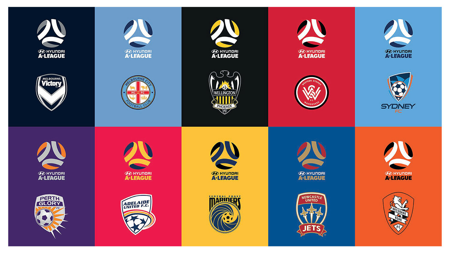
A - LEAGUE
Working from sketches and directions from the Creative Director, I created the art that was used across all of A-Leagues brands touch points.
Along with the initial brand, we created the visual identity to include the title sponsor, at the time, Hyundai. We then set about creating every teams personalised logo to align with the new visual identity. Allowing the FFA brand to take a step back to allow the teams colours to be the dominant feature was an overall part of the brand strategy.
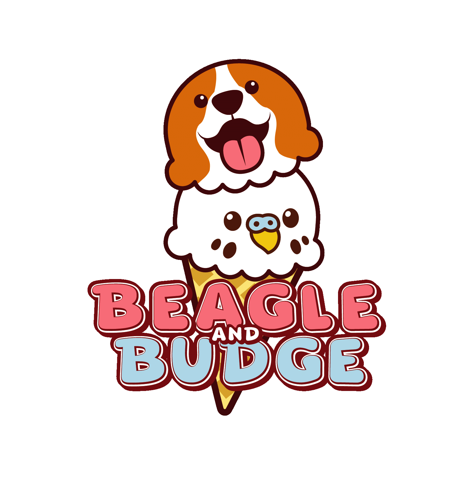
BEAGLE AND BUDGE
A fun, small project creating a visual identity for a clients entrepreneurial daughter who was creating ice cream brand named after their family pets.
Following the creative brief, I created an identity with a few alternating wordmarks, logos and assets. I made sure the assets were going to be easily usable for them to create stickers and signs adn any other material they might need.